
Lesson 3.1(1)

Data Insights Quiz
Test your knowledge of data representation and analysis with our engaging quiz! This quiz covers various aspects of data visualization, trends, and insights on cereal sales and rainfall patterns in different cities.
- Multiple choice questions
- Focused on data science and visualization
- Learn while you play!
The use of processes and algorithms to obtain information and insights from data collected
Image dimensions
Image resolution
Data science
Malware
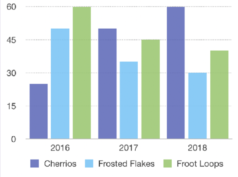
In what way is the data shown here?
Column chart
Table
Line chart
Pie chart
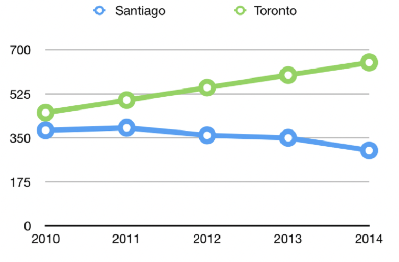
In what way is the data shown here?
Column chart
Table
Line chart
Pie chart

In what way is the data shown here?
Column chart
Table
Line chart
Pie chart
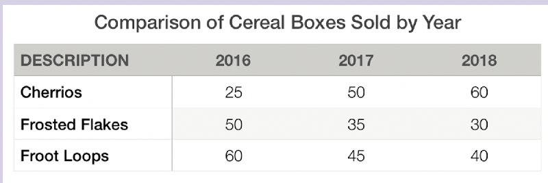
Here is a table of the number of cereal boxes sold over the course of......................?
3 months
4 years
3 years
1 year

In .................., Froot Loops sold the most cereal boxes.
2016
2017
2018

Cheerios sold ................... Boxes every year between 2016 and 2018
More
Less
Same amount

Frosted flakes sold ....................... Boxes every year between 2016 and 2018
More
Fewer
Same amount
A.......................... Is good when we have continuous data over a period of time and we want to look at trends (direction of something changing) or patterns.
Table
Pie chart
Column chart
Line chart

In this line chart we have rainfall in......................... Cities over 5 years.
1
2
3
4

In this line chart we have rainfall in 2 cities over ....................... years.
3
4
5
6

We can see that the rainfall in Santiago has .............................
Increased
Decreased
Stay the same
We can see that the rainfall in Toronto it has.......................
Increased
Decreased
Stay the same

We can also predict that in 2015 and 2016, based on the trend, it will rain ..................... in Santiago
More
Less
Same amount

The rainfall relationship between the two cities is .........................
Equal
Opposite
{"name":"Lesson 3.1(1)", "url":"https://www.quiz-maker.com/QPREVIEW","txt":"Test your knowledge of data representation and analysis with our engaging quiz! This quiz covers various aspects of data visualization, trends, and insights on cereal sales and rainfall patterns in different cities.Multiple choice questionsFocused on data science and visualizationLearn while you play!","img":"https:/images/course7.png"}
More Quizzes
INTRODUCTION TO DATA SCIENCE
10533
DataScienceUnit1
12626
Guess the Baby?
840
Lion Group Personality Quiz: This is for psychology class, we are measuring what the best music choice for you is based on your personality. We are using theory 1 in the personality theories learned in Mr. Mahoods class. Remember, we are not judging you, this is just simply what research shows.
14717
Fire Extinguisher Maintenance Steps - Free Practice
201017942
Guess Who Did It - Solve the Mystery (Free)
201019527
Internet Questions - Test Your Web Knowledge
201020474
Migraine vs Headache - Find Your Migraine Type
201018866
Coordinate Geometry Post Test - Free Practice
201017487
Which Power Ranger Are You? Free Character Match
201019142
Charlie the Unicorn - Free Online Trivia
201018866
Spanish-Speaking Countries & Capitals - Free Practice
201017635